Recent searches
Search options
Font size test, part 2. Download the fonts, alpha 0.1: https://www.davidrevoy.com/data/documents/2024-04-20_DeevadHand_alpha1.zip (265KB, Open Font License)
 says: Thank you For your feedback on
my previous post. I forked 'Patrick Hand' and used it to customize my own font called deevadhand.
It should be easily readable.
Except if I mumble in a 14px size font, or worst in a 12px size font, hi hi.
Then, the page list specifications of both fonts, with an alphabet.")
@davidrevoy Steinig this font in use and comparing it to the last one (Kalam), I can read Kalam better. IMHO there are too many straight vertical lines in Deevadhand (and it is too narrow). Perhaps it is more readable when in cursive and a little bit more space between the characters.
@AxelStieglbauer Hey, I had same feeling with Kalam (that's why I put it in the demo speechbubble, and it had a green checker next to it) but also, I have some troubles (slight dyslexia, dysgraphia too) and what is readable for me is often not something agreed universally.
But sure, a bit more spacing on DeevadHand could help. I dislike when the letter are also touching each other. With JPG compression and downscaling, it feels like a soup sometime. 

@davidrevoy
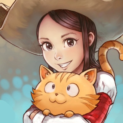
To put the fonts in a "real life test", could you make one of your Pepper&Carrot comics in a Kalam and in a DeevadHand version?
Results of tests in the lab (in the showcase boxes below the one-frame-comic) may not transfer well to the intended use cases.